

Fonts play a crucial role in every design project, from branding and web design to print media and beyond. Whether you’re a beginner just starting out or an experienced designer, understanding how to pick the right font and use it effectively can elevate your work. One key step is finding the perfect typeface for your needs – and that often starts with a quick font download from a reliable source. For example, Creative Fabrica offers a fantastic collection of font downloads, including free fonts that you can experiment with.
In this guide, we’ll walk you through how to choose the right fonts for different projects, how to install fonts on Windows and Mac, and best practices for pairing and using fonts. Let’s dive in and get you confident with your fonts!

Picking the Right Fonts for Different Design Projects
Choosing the right font can make or break a design. The font you use for a playful children’s birthday invitation will likely be very different from the one you choose for a corporate business card. Here are some considerations and tips to help you select the perfect font for any project:
- Understand the Mood and Message: Fonts have personality. A flowing script font conveys elegance or creativity, a bold sans-serif feels modern and strong, while a classic serif exudes tradition or trustworthiness. Before selecting a font, think about the mood and message of your project. For instance, if you’re designing a logo for a law firm, a clean serif font might project professionalism and reliability. On the other hand, if it’s a poster for a music festival, you might lean towards an eye-catching display or handwritten font to capture an energetic vibe.
- Consider Readability: No matter how stylish a font looks, it must be readable. This is especially important for longer texts or smaller sizes. For body text in a brochure or a website, stick to highly legible fonts (often simple serifs or sans-serifs) that are easy on the eyes. Save those fancy decorative typefaces for headlines or accents where you want to draw attention.
- Limit Your Font Choices: It’s easy to get carried away with the hundreds of cool fonts available, but using too many in one design can look chaotic. A good rule of thumb is to stick to two (or at most three) fonts per project: typically one for headings/titles and one for body text (and possibly another for a special accent).
By keeping these points in mind, you can confidently choose fonts that enhance your design rather than distract from it. Next, once you have the fonts you love, you’ll need to install them on your computer so you can start using them in your design software.
How to Download and Install Fonts on Windows & Mac
Once you’ve picked out a great font (or two) for your project, it’s time to get it onto your computer. Installing fonts is a straightforward process, but it can vary slightly between Windows and Mac. We’ll outline the steps for each, referencing tips from Andie Letourneau’s font installation guide to ensure everything goes smoothly.
Installing Fonts on Windows
- Download the font file: After choosing a font, click the download button or link. The font will usually arrive as a .zip file (especially if it includes multiple styles). Save this file to a location you can easily find, like your Downloads folder.
- Unzip the file: A ZIP file is a compressed folder that needs to be extracted. In Windows, you can unzip by right-clicking the file and selecting “Extract All…”, and then following the prompts to unpack the contents. Once unzipped, open the new folder that contains the font files. You might see files with extensions like .TTF (TrueType Font) or .OTF (OpenType Font) – these are the font files.
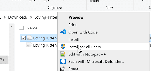
- Install the font: Locate the .TTF or .OTF file for the font. Right-click on the font file and click “Install”. If you have administrator privileges on your PC, you may instead choose “Install for all users” to make the font available to anyone on the computer (this will prompt for an admin password if you’re not the admin). After you click install, the font will be registered on your system.
Installing Fonts on Mac
- Download and unzip: Download the font’s .zip file to your Mac (it will likely go to your Downloads folder). Double-click the .zip file and macOS will automatically extract it into a folder of the same name.
- Open the font file: Inside the extracted folder, find the font file (it will have a .TTF or .OTF extension). Double-click the font file. A Font Preview window will open, showing a sample of the font and an “Install Font” button.
- Install the font: Click the Install Font button. This will open the Font Book application and add the font to your Mac (you may be asked to enter your password to authorize the installation).
- Confirm and use: The font is now installed on your Mac. You can open Font Book to verify it’s listed. To use the font, open any application like Pages, Adobe InDesign, or Photoshop and find the font in the text menu. If the app was open while you installed the font, restart it so the new font appears.
“If Silhouette Studio – or any other application you want to use the font in – was running when you installed the font, you have to close the application and then reopen it to load the font because applications only check for and load fonts when they are first launched.” — Andie Letourneau
This advice is a good reminder: you may need to restart your design software after installing new fonts so they show up. Now that your fonts are installed, let’s move on to tips for pairing them effectively and some best practices for typography.
Best Practices for Using Fonts in Design Work
Finally, here are some general best practices to keep in mind whenever you’re working with fonts in any design:
- Establish a Hierarchy: Decide which font (and size/style) to use for headings versus body text, and apply it consistently throughout your design. A clear typographic hierarchy helps guide the reader’s eye and makes your layout easy to navigate.
- Mind the Spacing: Pay attention to the space between letters (kerning) and lines of text (leading). Adjust these if needed to improve readability. Proper spacing—and clean alignment—can make your text much more legible and visually appealing.
- Don’t Stretch or Squeeze Fonts: Avoid arbitrarily stretching, compressing, or skewing a font to make it fit a space. Distorting fonts can make them look awkward and hurt readability. Instead, if a piece of text doesn’t fit, try adjusting the font size or margins, or choose a condensed version of the font if available. Using a font’s intended variations is far better than manually squashing or stretching the letters.
- Use the Right Format for the Medium: Ensure you’re using fonts in the correct way for the project. For print design, simply install the font on your system and use it in your layout. For web design, use web-safe fonts or embed web font files (via services like Google Fonts or similar) so that your chosen font displays correctly for all users.
- Check Color Contrast: Ensure sufficient contrast between text and background so that your text is easily readable. For example, dark text on a light background (or vice versa) usually works best.
By following these best practices, you’ll ensure that your typography is not only beautiful but also functional and accessible. Paying attention to these details is what often separates amateur-looking designs from professional ones.
Conclusion
Fonts are a designer’s best friend. From selecting the perfect typeface for a project, downloading and installing it, to artfully pairing it with others and applying good typography habits, mastering fonts is a journey that blends creativity with technique.
With font download libraries at your fingertips and a solid understanding of how to use fonts effectively, you have all the tools you need to make your next design project stand out. Remember, every font carries its own voice. By picking the right font (or combination of fonts) and using them thoughtfully, you amplify your design’s message and impact.
So go ahead – explore new fonts on Creative Fabrica and other trusted sites, experiment with font pairings, and most importantly, have fun with your typography. Your text isn’t just words on a page; with the right font choices, it becomes an experience for your audience. Happy designing!